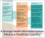
Health Information Systems Infographics
 cl-19-040.zip
—
Zip archive,
173 kB (177,621 bytes)
Author(s): MEASURE Evaluation
Year: 2019
 Abstract:
Health systems rely on health data so policy makers can understand what health issues people are facing in a given country, what health programs are working, what resources are available, and what changes should be made to optimize health. The systems that produce this data are as complex as the overall health systems they support; and they comprise data collected from the smallest health clinic to the national health ministry. Further, to be of any use in improving health, data collection is not enough. Someone must check their quality; someone must aggregate data from many sources; someone must analyze what the data are saying. Then, someone must put this learning to good use. The operation and interaction that occur daily within a health information system (HIS) is sometimes easier to grasp in visual terms. This collection of graphics tells part of the story of how an HIS performs and what it can contribute to health improvements.


